Overview
Citi’s legacy mobile app served millions of users across APAC but had fragmented user flows, inconsistent UI, and poor discoverability of key features such as rewards and card activation. As part of the redesign team, my role was to simplify core journeys, build a scalable design system, and improve usability while ensuring compliance with financial regulations and accessibility standards.
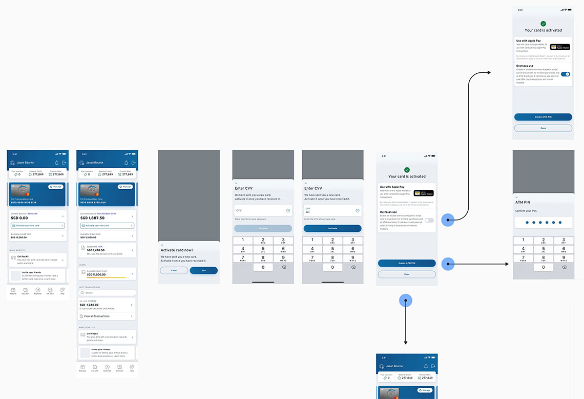
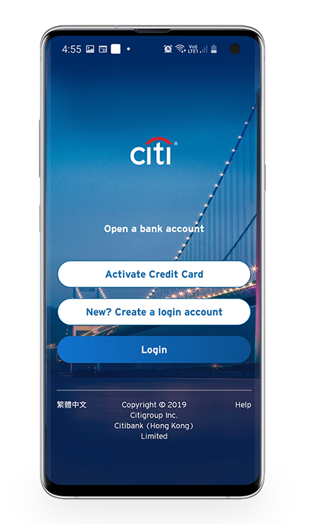
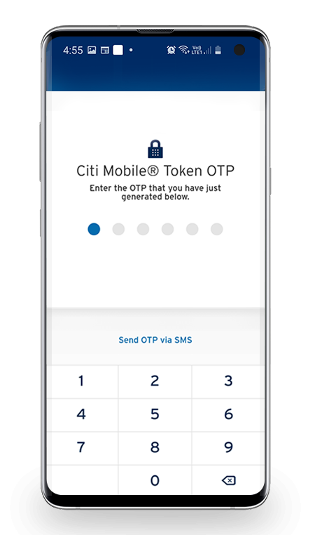
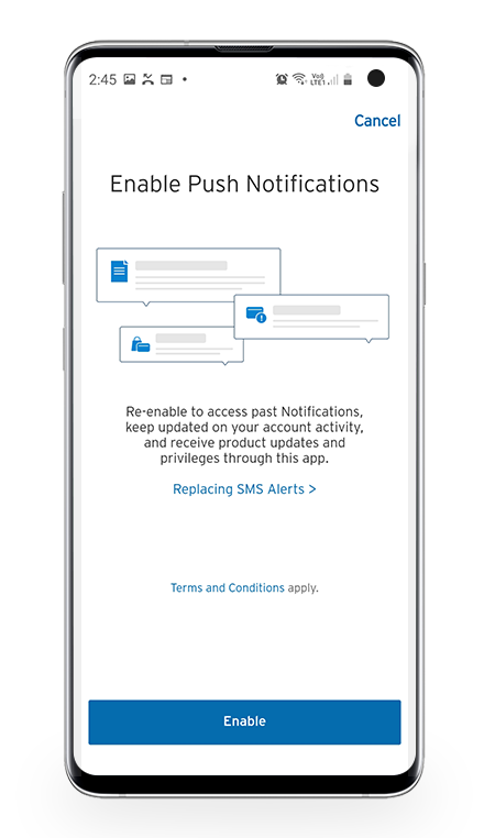
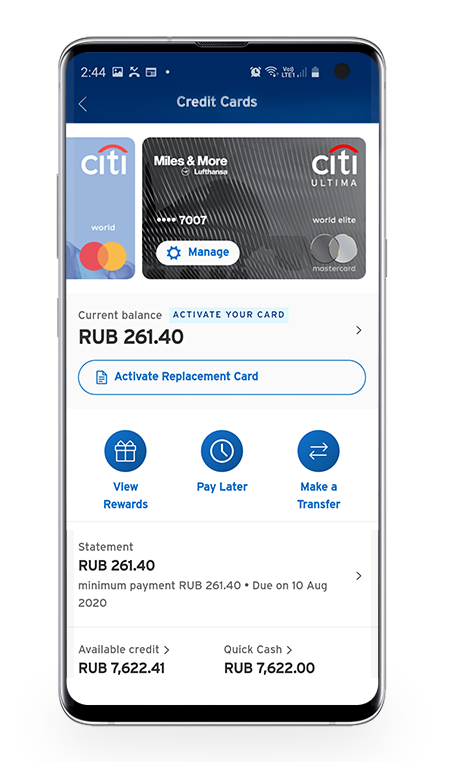
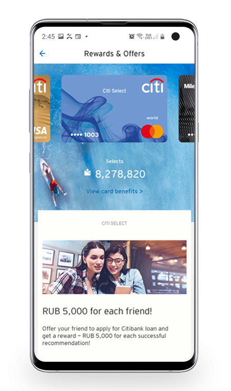
Problem: Users faced long login and card activation journeys, with up to 7 steps and high drop-off. Rewards were buried 5+ taps deep.
Process: I ran workshops, created low-fi wireframes, and mapped end-to-end user flows. This revealed pain points (redundant steps, unclear hierarchy).
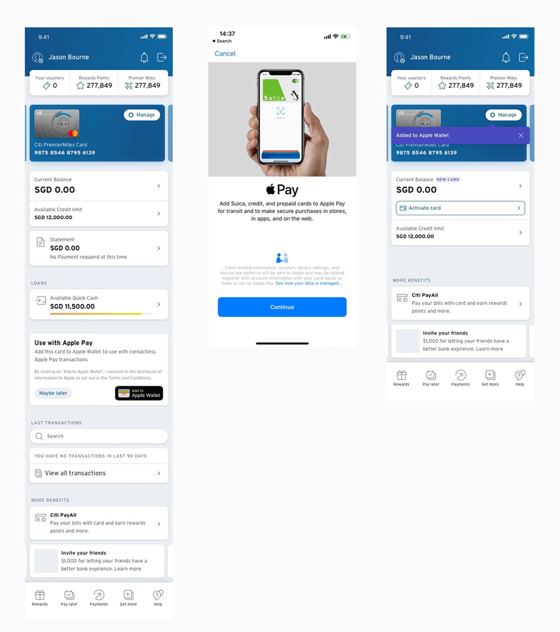
Outcome: Defined simplified flows, tested with stakeholders, and prepared mid- to hi-fi prototypes in Figma.


Login & Authentication
Old: 7+ steps, scattered OTP/password screens, unclear hierarchy.
New: Consolidated into 4 steps, consistent feedback, streamlined push notification setup.
Impact: 30% faster login completion, fewer abandoned sessions.
Dashboard & Rewards
Old: Rewards hidden under multiple menus, card balances not prioritized.
New: Dashboard now surfaces balance, payments, and rewards in 1 view.
Impact: Reduced navigation depth 5 → 2 taps, higher rewards engagement.
Apple Pay Integration
Old: Users had to leave Citi app to set up Apple Pay, leading to drop-offs.
New: Embedded Apple Wallet flow inside Citi app.
Impact: Improved adoption of contactless payments.


